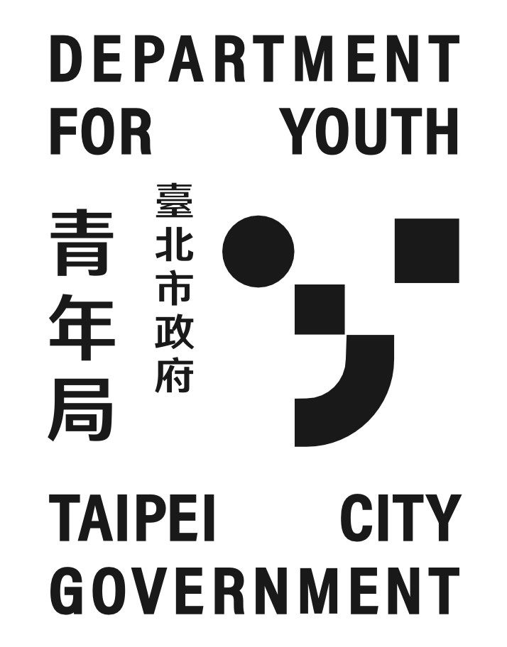
Based on the shape of the letter "Y" in "Youth," use circles, squares, curves, and other geometric shapes to playfully outline the form of a lowercase "y." The combination of these three shapes represents diversity, inclusivity, and creative innovation, forming a confident smile-like figure that also echoes the visual impression of a QR code. The unit's name, in both Chinese and English, should be integrated into the design as a horizontal element, making the graphic and text a cohesive whole rather than using traditional text as a descriptive supplement. Harnessing the power of text can express the bold and confident characteristics of young people, resulting in a distinctive and trendy identity design.